Lost in Translation: Decoding the U.S. Healthcare System with Conversational UI
Brand
Conversational UI
Year
2026
The "Systemic Shock"
Imagine landing in a new country. You’ve mastered the language, navigated the visa process, and unpacked your bags. But then, you get a sore throat. In your home country, you would simply walk into a clinic. Here in the United States, you are handed a plastic card covered in alphanumeric codes and told to "find an in-network provider to avoid a high deductible."
For international students, navigating the U.S. healthcare system isn't just confusing…it’s paralyzing.
Our research revealed a staggering reality: 80% of international students suffer from "financial blindness," unable to predict their out-of-pocket medical costs. The result? They delay necessary care, rely on unverified advice from group chats, or face massive surprise bills.
We realized we didn't need to build another dashboard or a better FAQ page. We needed a cultural interpreter.
Scope of Work
Meet the Users: The Academic and The Anxious
To ground our Conversational User Interface (CUI) design, we focused on two distinct user journeys that emerged from our affinity mapping:
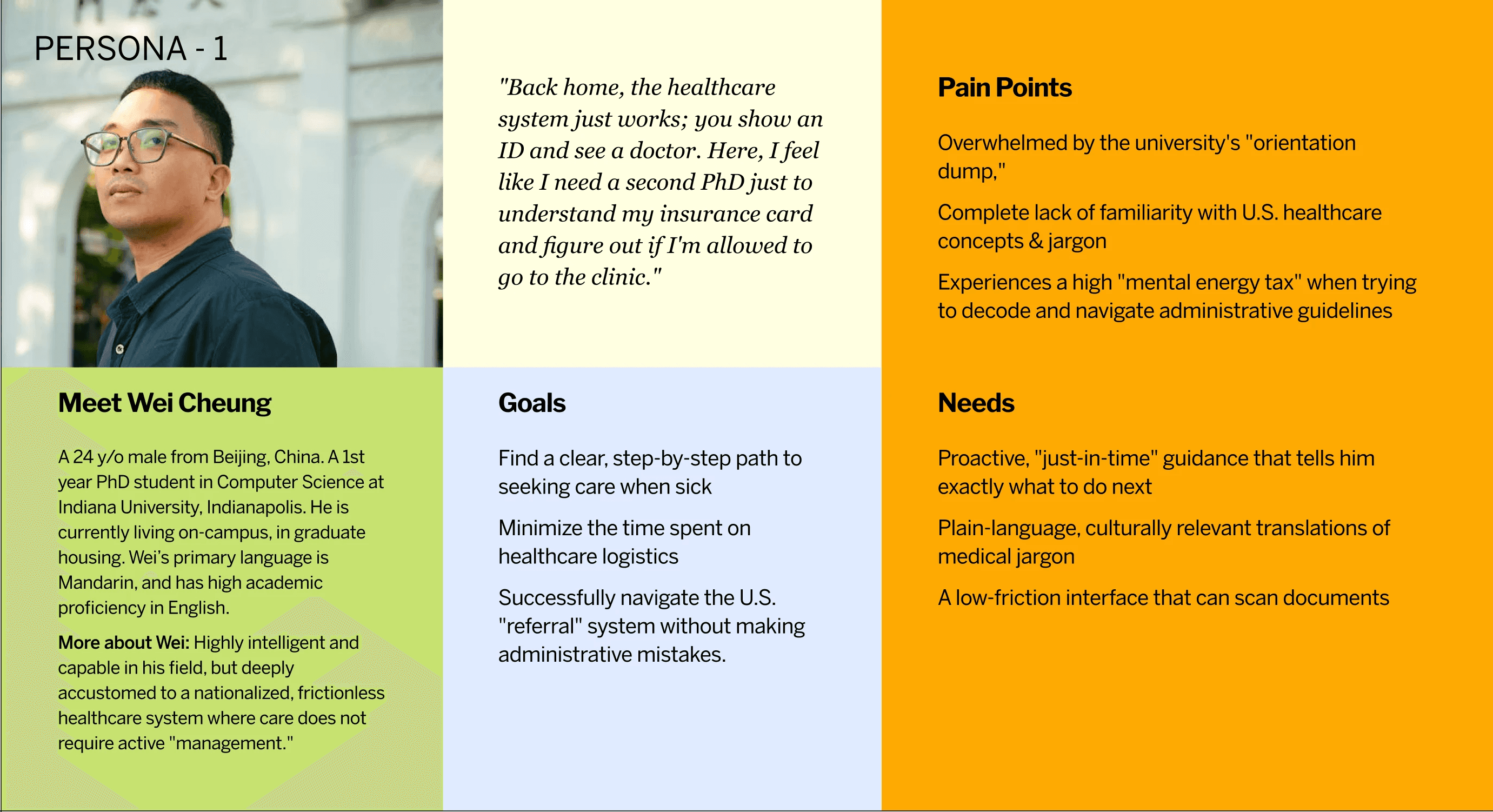
Wei: The "Systemic Shock" Academic
Wei is a brilliant 1st-year PhD student from China. His academic English is flawless, but medical English is entirely foreign. Coming from a nationalized healthcare system, he expects care to "just work." Instead, he was hit with a massive "orientation dump" of insurance PDFs on his first day, which he promptly ignored. He doesn't know what to do until he's already sick.
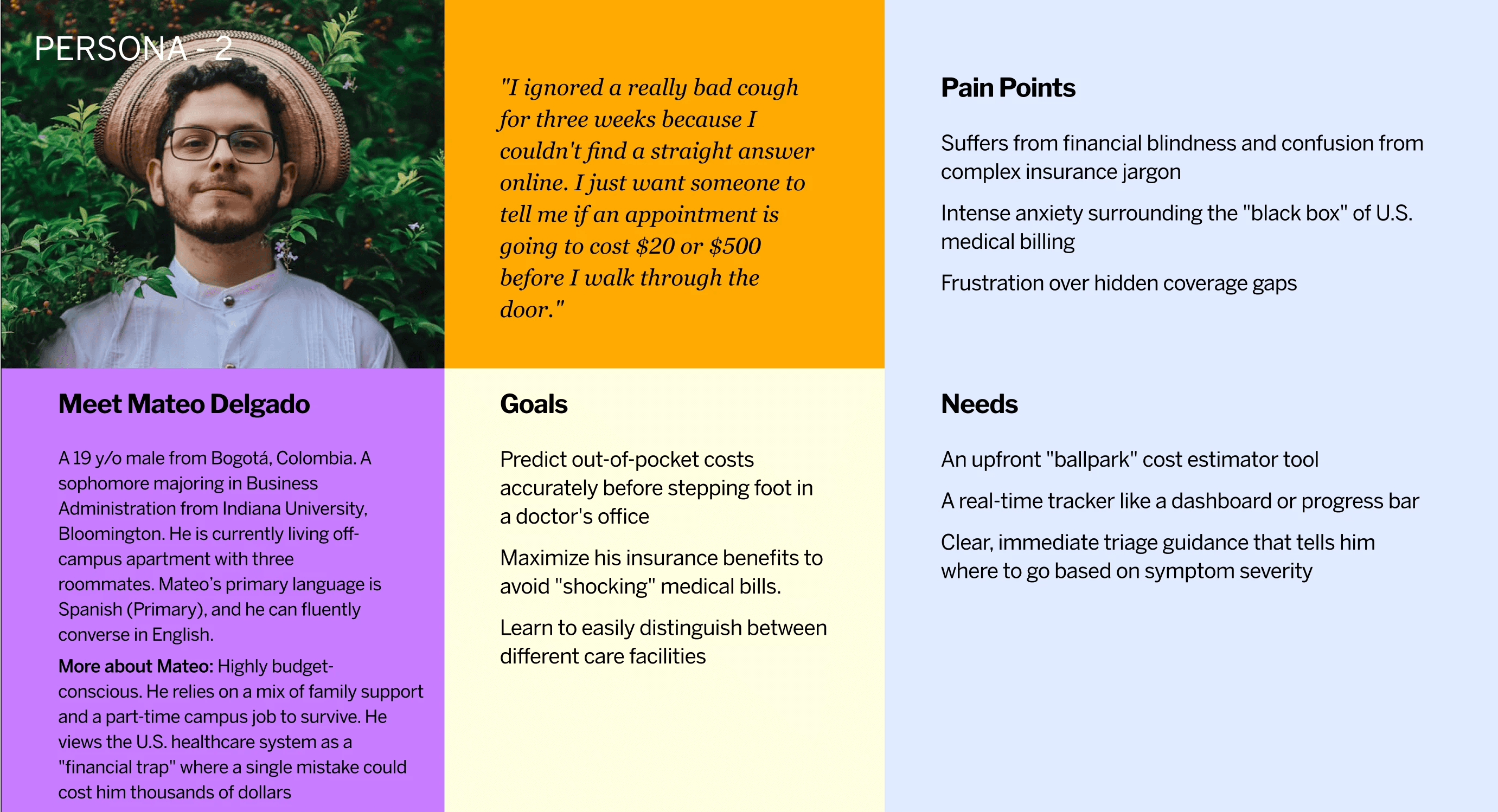
Mateo: The Financially Anxious Undergrad
Mateo is a budget-conscious sophomore from Colombia. To him, the U.S. system is a financial trap where one mistake could cost thousands. When he sees the word "Coinsurance," he panics. He has actively skipped doctor's visits for minor issues because he cannot calculate the upfront cost.
The Strategy: From "Definition Source" to "Decision Support"
Our usability testing revealed a critical UX insight: users could understand isolated terms, but they lacked the mental model to understand how the system interacted.
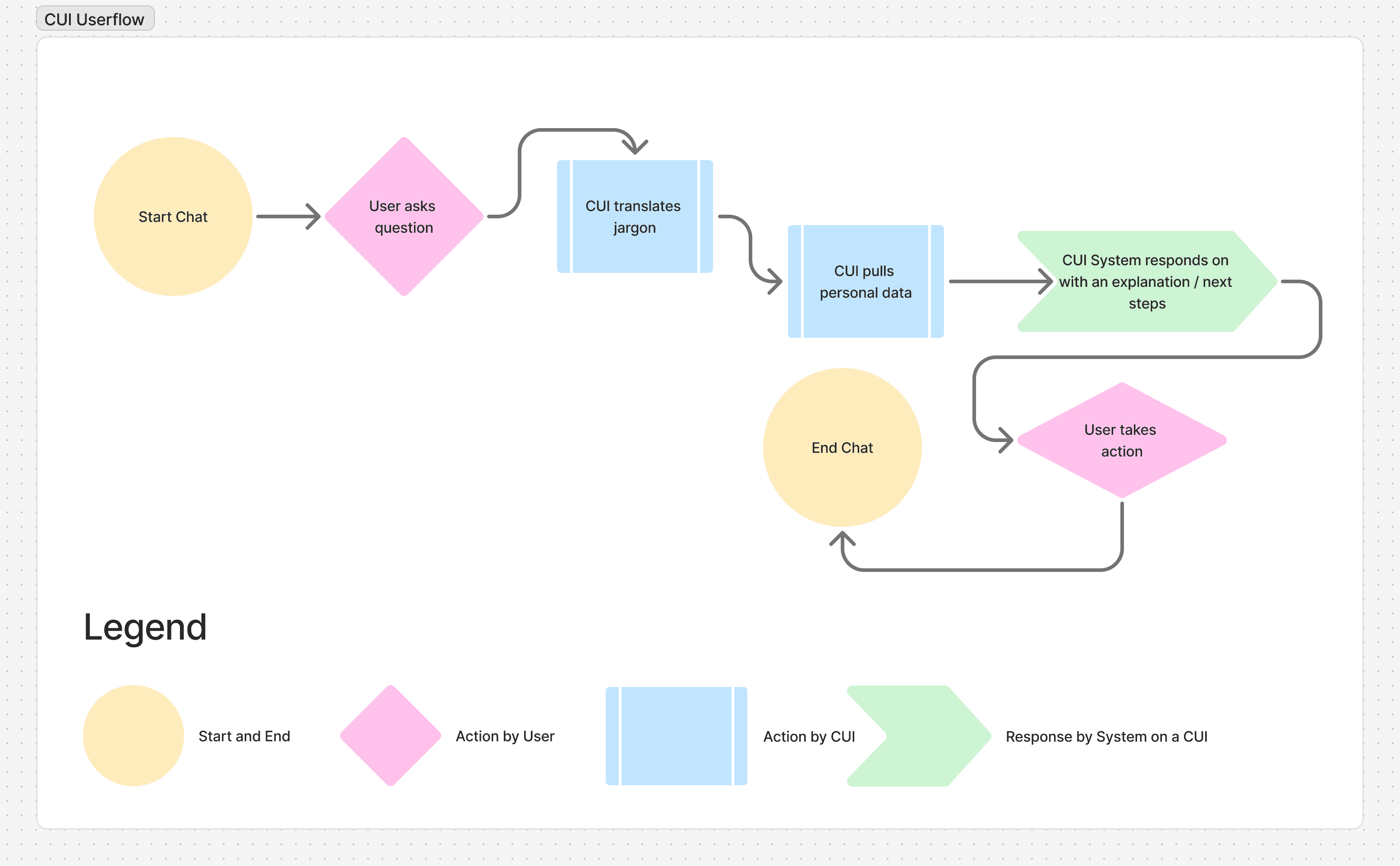
We designed Health Connect, a CUI built on the principle of progressive disclosure. Instead of dumping information, the CUI responds to natural language queries, uses OCR to read physical documents, and actively bridges the gap between learning a term and making a real-world health decision.
Mateo’s Breakthrough: Erasing the Financial Black Box
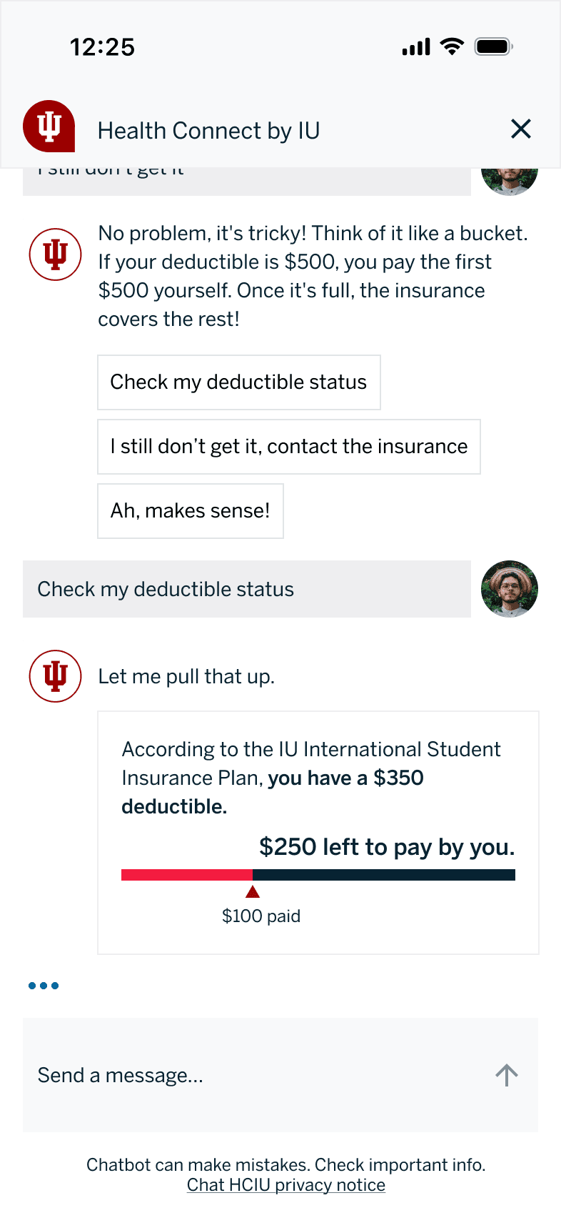
Mateo needs to see a doctor but is terrified of the cost. He opens Health Connect and types: "What does deductible mean?"
The CUI Magic:
The "Real-Talk" Translation: The CUI doesn't give a dictionary definition. It uses a "cover charge" analogy, a relatable concept.
Contextual Integrity: The CUI doesn't stop at the definition. It provides a quick reply button: "Check my status."
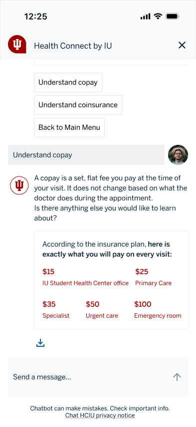
Actionable Data: By tapping the button, the CUI pulls Mateo's specific plan data. It shows him a visual progress bar of his $350 deductible. Then, it proactively lists his exact copays: $15 at the Campus Health Center.
The Result: Mateo's financial paralysis is cured. Armed with the knowledge that a visit will only cost $15, he books the appointment immediately.
Wei’s Journey: The Card Decoder & Proactive Nudges
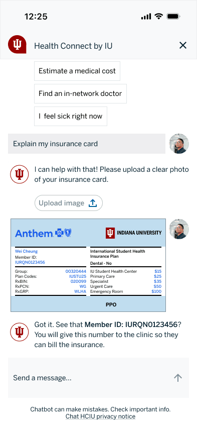
Wei finally receives his physical insurance card in the mail. It is a soup of jargon: RxBIN, Group Number, Payer ID.
The CUI Magic:
Reducing Friction with OCR: Wei snaps a photo of the card. The CUI uses optical character recognition to instantly decode the text.
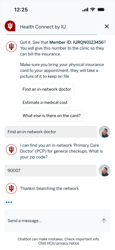
The Conversational Post-Expansion: The CUI highlights his "Member ID" and explains it is his "medical passport." But the true UX win happens next. Leveraging conversational management, the system proactively asks: "Since you just got your card, do you want to find a doctor nearby before you get sick?"
Seamless Navigation: Wei enters his zip code, and the CUI surfaces three in-network clinics within two miles, completely bypassing the outdated, confusing PDF provider directories.
The Impact: Empowering a Vulnerable Population
By treating the interface as a conversation rather than a filing cabinet, we transformed the international student healthcare experience.
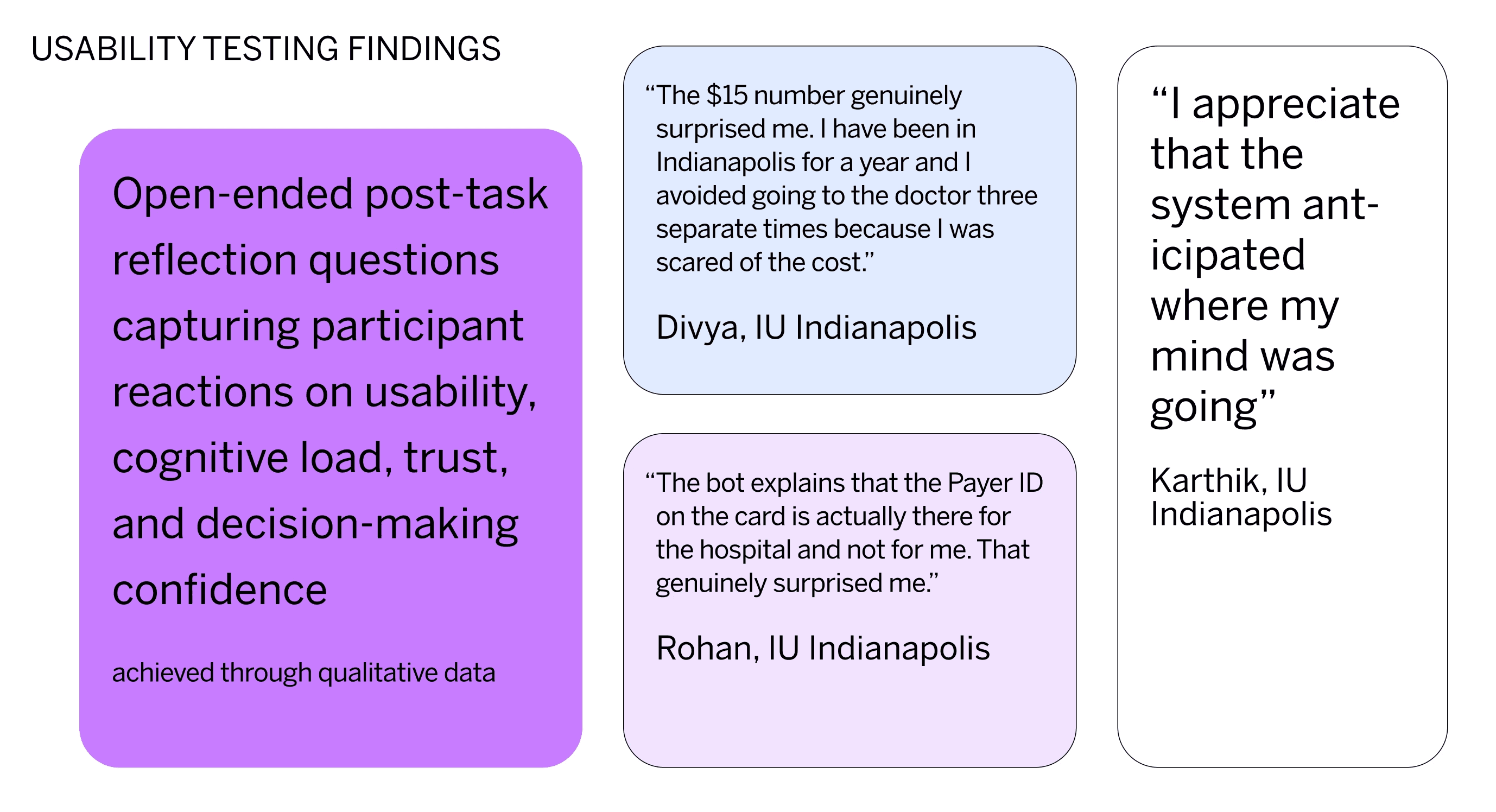
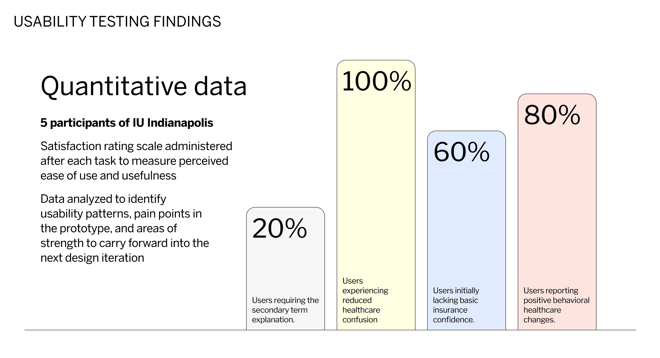
During our usability testing, here are some more findings that came with recommendations:
Finding | Recommendation |
|---|---|
Users understand terms, but not the insurance system as a whole | Add cost and term interaction flow |
Personalized data is more beneficial than abstract explanations | Integrate real-world scenarios along with surface plan-specific information |